【Python】Matplotlibで図中に複数のグラフを描画する
投稿日 2021年1月29日 >> 更新日 2023年3月1日
今回はPython外部ライブラリのMatplotlibを使用して複数のグラフを図中に描画していきたいと思います。
グラフの作成には幾つかあり、その中のFigure.add_subplotとFigure.subplotsを用いた方法を実装していきます。
実行環境&使用ライブラリ
| 実行環境 |
|---|
| Windows Subsystem for Linux |
| Python 3.6.9 |
| pip 9.0.1 |
| 使用ライブラリ | ライセンス |
|---|---|
| matplotlib==3.1.1 | PSF |
基本的なグラフの作成
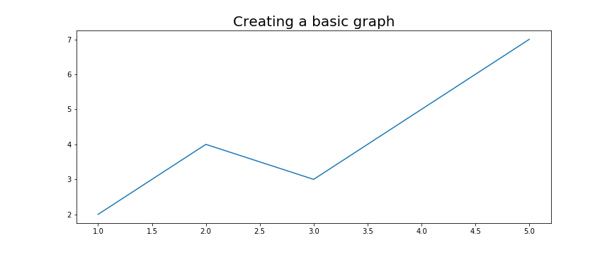
Matplotlibで1つグラフを作成する基本的な方法は恐らく以下のような書き方になるかと思います。
import matplotlib.pyplot as plt
x = [1, 2, 3, 4, 5]
y = [2, 4, 3, 5, 7]
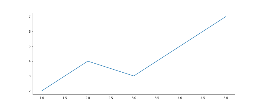
plt.figure(figsize=(12, 5)) # 図の大きさ(幅、高さ)
plt.plot(x, y) # 図にグラフを作成
plt.title("Creating a basic graph", fontsize=20) # 図のタイトル
plt.savefig('basic_graph.png') # イメージの保存
plt.show()
次に図の中にあるグラフで異なるイメージを表示させる場合は同じように一行追加して表示できます。
x = [1, 2, 3, 4, 5]
y = [2, 4, 3, 5, 7]

plt.figure(figsize=(12, 5))

plt.plot(x, y) # 表示1
plt.bar(x, y) # 表示2
plt.title("Creating a basic graph", fontsize=20)
plt.show()
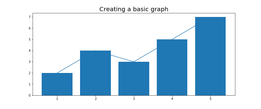
この方法だと、同じグラフ内でしかイメージを描けないので、「Figure.add_subplot」もしくわ「Figure.subplots」を呼び出して複数のグラフを設定します。
Figure.add_subplotによるグラフの追加
add_subplotメソッドでは、引数に作成したいグラフの行、列、位置を指定することで複数のグラフを設定できます。
まずは単一のグラフを設定してみます。
fig = plt.figure(figsize=(12, 5)) # 図のサイズを設定して初期化

ax_1 = fig.add_subplot(1, 1, 1) # 1行1列の1番目の位置にグラフを作成

plt.show()
上図は基本的な処理で行った実装と同じ結果が表示されました。
続いて複数のグラフを追加していく場合は、add_subplot(行, 列, インデックス)の引数である「行・列」を均一にしてインデックスであるグラフの位置を設定します。
fig = plt.figure(figsize=(12, 5))

ax_1 = fig.add_subplot(1, 3, 1) # 1行3列の1個目
ax_2 = fig.add_subplot(1, 3, 2) # 1行3列の2個目
ax_3 = fig.add_subplot(1, 3, 3) # 1行3列の3個目

plt.show()
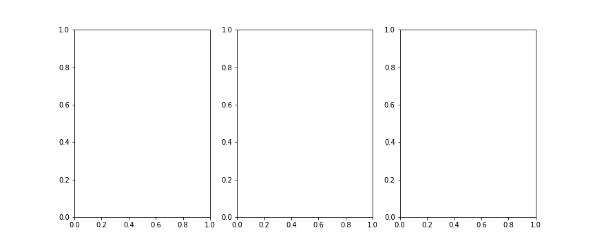
上図では横方向にグラフが並んでいますが、1行に3つのグラフとして設定しているので横並びとなりました。
続いて2行目にもグラフを設定するために、add_subplot引数を2行3列設定して、2行目では3列分の幅を使用してグラフを設定してみます。
fig = plt.figure(figsize=(12, 5))

ax_1 = fig.add_subplot(2, 3, 1)
ax_2 = fig.add_subplot(2, 3, 2)
ax_3 = fig.add_subplot(2, 3, 3)
ax_4= fig.add_subplot(2, 3, (4, 6)) # 2行目の1~3列分グラフを作成

plt.show()

add_subplot(行, 列, インデックス)のインデックス番号では大きい順に右に向かって作成されています。
従ってax_4のグラフでは3列分の幅を使用していますが、add_subplot引数の第三引数であるインデックス番号を4~6個分のグラフをタプルでまとめて指定することにより3つ分の位置を確保できます。
ax_4= fig.add_subplot(2, 3, (4, 6))
ではグラフにデータを挿入してイメージを表示させてみます。
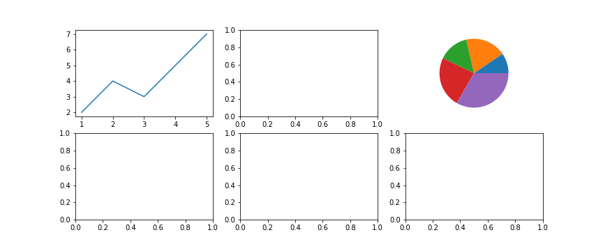
挿入データを準備して一番目のグラフであるax_1だけにプロットを実行させてみると
x = [1, 2, 3, 4, 5]
y = [2, 4, 3, 5, 7]

fig = plt.figure(figsize=(12, 5))

ax_1 = fig.add_subplot(2, 3, 1)
ax_2 = fig.add_subplot(2, 3, 2)
ax_3 = fig.add_subplot(2, 3, 3)
ax_4 = fig.add_subplot(2, 3, (4, 6))

ax_1.plot(x, y)

ax_1.set_title("line") # 1つ目のタイトル

fig.suptitle("Creating a subplots") # 図全体のタイトル
plt.show()
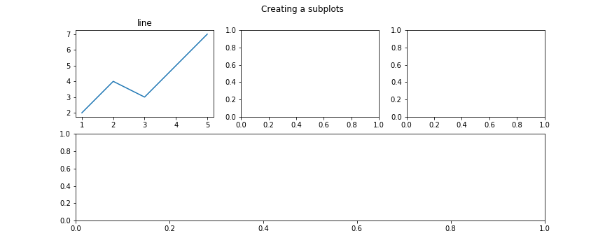
一番目のグラフに線グラフを描けました。
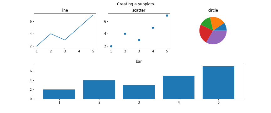
続けて全てのグラフに当てはめてみると以下のようになります。
x = [1, 2, 3, 4, 5]
y = [2, 4, 3, 5, 7]

fig = plt.figure(figsize=(12, 5))

ax_1 = fig.add_subplot(2, 3, 1)
ax_2 = fig.add_subplot(2, 3, 2)
ax_3 = fig.add_subplot(2, 3, 3)
ax_4 = fig.add_subplot(2, 3, (4, 6))

ax_1.plot(x, y)
ax_2.scatter(x, y)
ax_3.pie(y)
ax_4.bar(x, y)

ax_1.set_title("line")
ax_2.set_title("scatter")
ax_3.set_title("circle")
ax_4.set_title("bar")

fig.subplots_adjust(hspace=0.5) # グラフ間を0.5%分空ける
fig.suptitle("Creating a subplots")
plt.show()
凡例枠なども付け加えてみると以下のようになります。
x = [1, 2, 3, 4, 5]
y = [2, 4, 3, 5, 7]

fig = plt.figure(figsize=(15, 8))

ax_1 = fig.add_subplot(2, 3, 1)
ax_2 = fig.add_subplot(2, 3, 2)
ax_3 = fig.add_subplot(2, 3, 3)
ax_4 = fig.add_subplot(2, 3, (4, 6))

label = "today" # 凡例枠用のラベルテキスト

ax_1.plot(x, y, label=label) # 凡例追加
ax_2.scatter(x, y, label=label) # 凡例追加
ax_3.pie(y, labels=x, autopct='%1.1f%%')
ax_4.bar(x, y, label=label) # 凡例追加

ax_1.set_title("line")
ax_2.set_title("scatter")
ax_3.set_title("circle")
ax_4.set_title("bar")

# 各グラフの凡例枠を表示
ax_1.legend()
ax_2.legend()
ax_3.legend()
ax_4.legend()

fig.subplots_adjust(hspace=0.5)
fig.suptitle("Creating a subplots", fontsize=20)
plt.show()
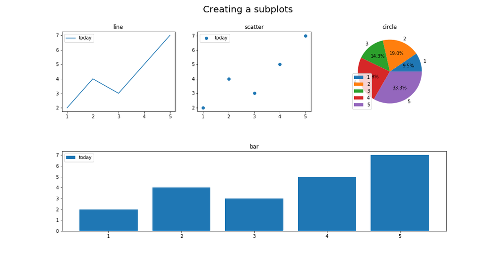
Figure.subplotsによる複数のグラフを設定
subplotsメソッドは、一度に複数のグラフを設定して描画することができます。
まずは1行1列の単一のグラフを作成してみます。
import matplotlib.pyplot as plt

x = [1, 2, 3, 4, 5]
y = [2, 4, 3, 5, 7]

fig, ax = plt.subplots(nrows=1, ncols=1, figsize=(12, 5)) # (行, 列, 図のサイズ)

ax.plot(x, y)

plt.show()
上図ではplt.subplotsとして2つの戻り値があり、fig変数にはFigureクラスのインスタンスが格納され、axにはFigure.add_subplot同様AxesSubplotクラスのインスタンスが格納されます。
fig, ax = plt.subplots(nrows=1, ncols=1)

print(type(fig))
print(type(ax))
print(type(fig.add_subplot(1, 1, 1)))
# <class 'matplotlib.figure.Figure'>
# <class 'matplotlib.axes._subplots.AxesSubplot'>
# <class 'matplotlib.axes._subplots.AxesSubplot'>
次に2行3列からなるグラフを作成して、特定の位置にイメージを描画してみます。
各グラフにイメージを描画する位置は、axsインスタンスでスライスにより指定します。
x = [1, 2, 3, 4, 5]
y = [2, 4, 3, 5, 7]

fig, axs = plt.subplots(2, 3, figsize=(12, 5))

axs[0, 0].plot(x, y) # 1行1列目に表示
axs[0, 2].pie(y) # 1行3列目に表示

plt.show()
subplotsメソッドでは、一度の初期化により行と列で指定したグラフの数が定まってしまうため全て均一のグラフとなっています。
例えば2行目のグラフだけ3列分のスペースを取った横長のグラフにしたい場合などは、一度2行目のグラフを削除して新しくグラフを作成して同じ位置に置き換えるといった方法になります。
削除したい行や列を指定することでその部分のみグラフを無くせます。
fig, axs = plt.subplots(2, 3, figsize=(12, 5))

# 2行目の1,2,3列を削除する処理
for ax in axs[1, :]:
    ax.remove()
削除された位置の行と列をadd_subplotメソッドに設定して、新しくグラフを作成します。
fig, axs = plt.subplots(2, 3, figsize=(12, 5))

for ax in axs[1, :]:
    ax.remove()

axbig = fig.add_subplot(2, 3, (4, 6))
あとは各グラフのインスタンス変数でデータを挿入しイメージをプロットするだけです。
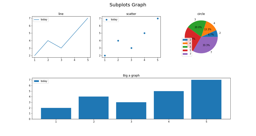
x = [1, 2, 3, 4, 5]
y = [2, 4, 3, 5, 7]

fig, axs = plt.subplots(2, 3, figsize=(15, 8))

for ax in axs[1, :]:
    ax.remove()

axbig = fig.add_subplot(2, 3, (4, 6))

label = "today"

axs[0, 0].plot(x, y, label=label)
axs[0, 1].scatter(x, y, label=label)
axs[0, 2].pie(x, labels=y, autopct='%1.1f%%')
axbig.bar(x, y, label=label)

# 各グラフのタイトル設定
axs[0, 0].set_title("line")
axs[0, 1].set_title("scatter")
axs[0, 2].set_title("circle")
axbig.set_title("Big a graph")

# 各グラフの凡例枠設定
axs[0, 0].legend()
axs[0, 1].legend()
axs[0, 2].legend()
axbig.legend()

fig.subplots_adjust(hspace=0.5) # グラフ間を0.5%分空ける
fig.suptitle("Subplots Graph", fontsize=20) # 図のタイトル
plt.show()

他にも様々なグラフの作り方があるので、余力のあるかたは探ってみて下さい。
それでは以上となります。
最後までご覧いただきありがとうございました。